


Why We Burn Differently? Finding the Hidden Patterns of Human Fitness
EDA : A deep dive into the rhythms of exercise, energy, diet and body composition through real workout data.
There’s something fascinating about how our bodies respond to movement. Every workout we do leaves a hidden pattern not just in our muscles, but in the data that quietly records how we burn, recover, and adapt. Beneath the numbers are traces of human effort. A pulse that rises, calories that vanish, energy that shifts from fatigue to focus.
In this exploration, we’re not chasing proof or perfection just stories that live inside the data, waiting to show how fitness is more than routine, it’s the rhythm.
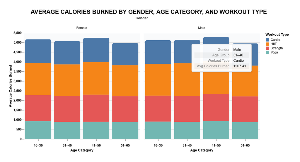
When we look at the data, something stands out immediately our calorie burn isn’t just about how long we move, but how we move. The chart above breaks down average calories burned by gender, age category, and workout type. And right away, you can sense a rhythm, a kind of balance between effort and adaptation across the years.
For both men and women, the total burn per age category stays surprisingly close. That means consistency, not decline, even as age climbs. What shifts, however, is the composition of that burn. HIIT and Strength training dominate the middle of the stack, showing that high-intensity and resistance-based workouts still drive the bulk of energy expenditure, regardless of age. Meanwhile, Cardio keeps a strong presence at the top, suggesting it remains the universal choice for maintaining endurance.
Interestingly, women in younger groups (16–30) show nearly equal balance between all workout types a sign of diversity in training habits. But as the chart moves toward the older age categories, the share of Yoga and low-impact activity slightly dips, replaced by more structured routines like HIIT and Strength. It’s a reminder that as we age, our bodies may not necessarily slow down we just get more strategic about how we train.
And for men, the story runs parallel. The total burn remains high through the 30s and 40s, with the combination of HIIT and Cardio sustaining most of the output. It’s as if the dataset whispers a quiet truth, fitness isn’t lost with age nor with gender, it just evolves with experience.
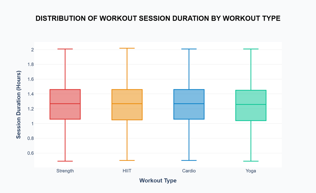
If the previous chart showed how much we burn, this one tells us how long we stay in motion. Because behind every calorie burned, there’s a time commitment that invisible trade between energy and endurance.
When we look at the distribution of workout duration, it’s clear that most people hover around one to one and a half hours, regardless of the workout type. It’s almost as if there’s an unspoken agreement among all exercisers: long enough to feel the burn, short enough to still have a life outside the gym.
But the differences are subtle and worth noticing. HIIT sessions, known for their intensity, show shorter lower-end durations some dipping under 40 minutes proving that effectiveness isn’t always about staying longer, but about working smarter. Strength and Cardio hold nearly the same middle range, balancing intensity and sustainability. Meanwhile, Yoga quietly stretches across a similar window, but with a slightly wider spread, hinting that people approach it more flexibly sometimes it’s a calm 45 minutes, sometimes it’s a full 2-hour recharge.
What’s beautiful here is the rhythm is even though workout types differ wildly in purpose, the data shows we tend to settle into our own balance point. Each person finds that duration where effort meets comfort, where the body feels pushed but not punished.
But “ What Exactly Most Popular Workout?”
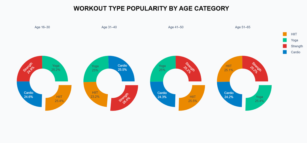
After looking at how long we train, the next question naturally comes up what do we actually choose to do with that time? Because if duration shows discipline, popularity shows preference.
The chart above makes one thing clear: no matter the age, fitness diversity is alive and well. From the youngest to the oldest group, the difference between workout types is incredibly balanced. It’s almost poetic as if every age group carries its own version of balance between intensity and mindfulness.
Among those aged 16–30, the pie looks evenly split between Cardio, Strength, HIIT, and Yoga. This hints at exploration a generation testing everything to see what sticks. As we move into the 31–40 range, a small shift appears: Strength training climbs slightly, while HIIT dips. Perhaps this is when people begin prioritizing strength and structure over raw intensity, realizing fitness is a long game, not a sprint.
By the 40s and 50s, the pattern stabilizes again, showing that consistency beats extremes. Yoga quietly maintains its share, proving that recovery and mobility never lose relevance. Even in the 51–65 group/ Senior People, where one might expect gentler workouts to dominate, Strength and HIIT still hold nearly a quarter each and yoga is slightly higher than other.
This data visual doesn’t just show preference, it reflects how we mature through movement. Fitness trends may come and go, but the instinct to stay balanced between effort and recovery, intensity and calm seems to grow stronger with time.
Is there any “Diet That Burns” more calories?
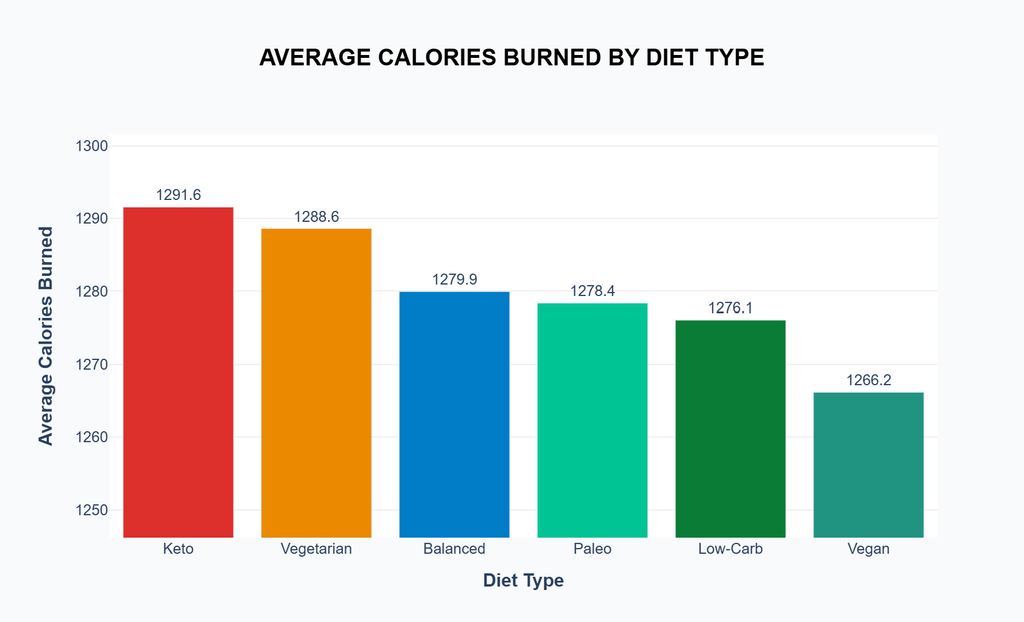
So far, we’ve talked about how we move. But what we fuel ourselves with plays an equally important role in how efficiently we burn energy. The next question is simple does our diet really affect how much we burn? From the data, the answer seems to be yes, but only subtly. As the chart shows, Keto leads the pack with an average of about 1,291 calories burned per session, just slightly ahead of vegetarian and balanced diets. While the gap might not look massive on paper, it’s interesting enough to explore why it happens.
The Keto diet (short for ketogenic) is built around the idea of shifting your body’s main energy source from carbohydrates to fats. When carbs are drastically reduced, your body enters a metabolic state called ketosis, where fat becomes the primary fuel instead of glucose. It’s like flipping an internal energy switch and this switch is what often leads to higher fat burn and slightly increased calorie usage.
But running on fat isn’t as simple as skipping bread for a few days. A true Keto diet typically keeps daily carbs under 50 grams, focusing instead on foods like avocados, eggs, cheese, fatty fish, olive oil, and leafy greens.
Still, Keto isn’t for everyone. Some bodies thrive on it, others don’t. And just like workouts, the most effective diet is often the one you can sustain without feeling like you’re constantly fighting yourself. The data reminds us that metabolism isn’t a competition; it’s a dialogue between how we eat, move, and recover.
The takeaways :
When we piece everything together from how much we burn, how long we move, what we prefer to do, and what we eat a clear pattern emerges, the human body is a master of adaptation. It doesn’t just respond to effort it learns from it. Whether it’s the balance between HIIT and Yoga, the steady duration that most people maintain, or the slight calorie edge of Keto over other diets, all these signals point to one truth fitness isn’t a race to the top, it’s an evolving conversation between motion, recovery, and nourishment. The data doesn’t show who’s best, but rather how each of us finds a flow that fits our life, proving that health isn’t built on intensity alone, but on the quiet consistency of doing what the body can sustain and enjoy over time.
Beyond the Scale: What Your Fat Percentage Really Says About Your Energy Burn.
Before diving deeper into how body composition affects energy use, it’s important to first understand one thing not all body fat is the same. To make the data easier to interpret, I decided to divide participants into three simplified categories without separating by gender, Low Body Fat (<15%), Medium Body Fat (15–25%), and High Body Fat (>25%). This grouping helps us see how the relationship between BMI (Body Mass Index), FP (Fat Percentage), and calories burned behaves across different body compositions. Think of it as observing how different “fuel systems” perform some bodies are lean and efficient, some store more energy, and others sit comfortably in the middle. Because while weight alone doesn’t define fitness, the way fat and muscle share space in your body often tells the real story behind how energy is produced, stored, and used.
Before that let me show you how many people for each of that Fat percentage counts.
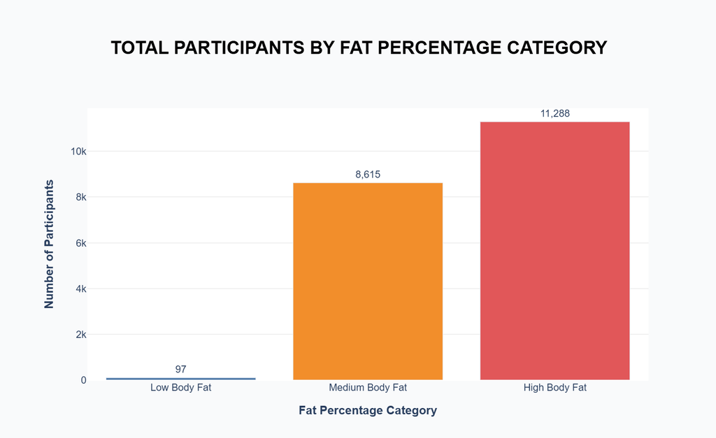
Looking at the distribution, it’s clear that most participants fall into the High Body Fat group, followed by Medium Body Fat, while Low Body Fat makes up only a tiny fraction of the dataset. This uneven spread tells us that most people in the sample carry a moderate to high fat percentage a realistic snapshot of everyday fitness levels. It also means that any trend we find later will likely be shaped by this dominant group, making the next comparisons even more interesting to interpret.
And Let Me show the correlation of BMI, Calories Burn by Fat percentage Categories.
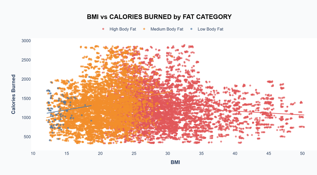
Now this is where things start to get interesting. When we plot BMI against Calories Burned and color it by fat category, the relationship becomes clearer and a bit counterintuitive. At first glance, you might expect higher BMI to mean higher calorie burn, since carrying more mass often requires more energy to move. But the data tells a subtler story.
For people in the High Body Fat group (red dots), the trend line actually slopes slightly downward. That means as BMI increases within this category, the calories burned tend to decrease a little. It suggests that excess body fat may reduce workout efficiency the body simply doesn’t move as Efficiently. In contrast, the Medium Body Fat group (orange) shows a gentler upward trend, meaning those with a balanced composition often get the best burn for their effort. The Low Body Fat group (blue) remains sparse but stable, showing consistent energy use regardless of BMI.
This pattern points to an important truth: calorie burn isn’t purely about size it’s about body composition quality. Muscles are metabolically active, fat is not, so two people with the same BMI could burn calories at totally different rates depending on how much of that weight is lean mass. The takeaway? Efficiency lives in balance not in being the heaviest, or the leanest, but in how your body turns stored energy into motion.
After exploring how body composition shapes energy use, the next big question is can we predict how much energy a person might burn just by looking at a few key indicators? In this part, I tried to find out by using three measurable factors: Workout Duration, Heart Rate, and BMI. Together, they represent time, intensity, and body profile the three pillars that usually define how much effort the body invests in every session. Think of it like trying to read the body’s “energy signature”: how long it moves, how hard it pushes, and how much mass it carries while doing so. The goal isn’t to create a perfect formula, but to see if data can capture what we usually feel that sweet balance between endurance, effort, and efficiency.

The prediction model turned out to be surprisingly honest about how our bodies work. When comparing the actual vs. predicted calories burned, the points align closely along the diagonal line meaning the model’s estimates follow real-world patterns quite well. It might not be perfect, but it captures the essence of what drives energy output: time, effort, and body composition.
The coefficients reveal something interesting. Workout Duration takes the lead by far, with a coefficient of 1202.4, showing that time spent moving is the biggest driver of calorie burn the longer you move, the more you burn, plain and simple. Heart Rate, however, has a small negative value (–0.20), which might sound counterintuitive at first. But this likely reflects that people with consistently higher heart rates aren’t always pushing harder sometimes it’s because they’re less conditioned, meaning their heart works more even for lighter activity. Meanwhile, BMI contributes only a tiny positive effect (0.03), reinforcing what earlier charts showed, body mass alone doesn’t strongly determine calorie burn, it’s how that mass is used that matters.
Together, these results tell a simple truth hidden behind complex data duration drives the burn, efficiency shapes it, and body type fine-tunes it. You don’t need to be the fittest or leanest to burn more; you just need consistency and control over how your body handles energy over time.
Let’s try finding hidden patterns in Body Composition.
Most of the time, we expect the body to behave linearly taller means heavier, heavier means higher fat percentage, and so on. But biology rarely plays by such simple rules. To dig deeper, I used a Polynomial Regression model to explore the nonlinear relationship between weight, height, BMI, and fat percentage. This approach lets the data bend a little, showing patterns that a straight line might miss. Because in reality, the way our body stores and burns fat isn’t perfectly proportional it curves, adapts, and shifts in ways that reflect how unique each person’s composition truly is.
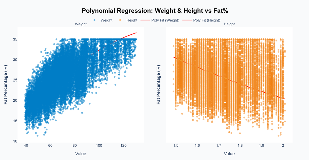
At first glance, body weight and height may seem like simple, predictable numbers. But when you look closer through a polynomial lens, the body reveals a far more dynamic relationship.
In the first plot, the curve between Weight and Fat Percentage shows a nonlinear climb the red line starts rising gently and then flattens as weight increases. This means that as people gain more weight, body fat percentage doesn’t increase endlessly; it tends to plateau. In other words, after a certain point, additional weight is often distributed as other body components rather than only pure fat. This curved behavior captures a truth we often miss when thinking in straight lines: the relationship between weight and fat isn’t simply “more weight equals more fat.” It’s shaped by how the body adjusts composition as it grows.
On the second plot, the relationship between Height and Fat Percentage bends the other way. The red polynomial curve slopes downward, showing that taller individuals generally carry lower fat percentages. This likely reflects proportional balance as height increases, overall mass spreads across a larger frame, naturally reducing fat ratio even if total body weight rises.
Together, these two curves illustrate how human composition balances itself out. Weight may influence how much energy the body stores, but height defines how that energy is spread. The combination of both explains why two people with identical weights can have completely different body fat levels because our bodies, unlike equations, don’t grow in straight lines.
In the end, what this data really shows isn’t just numbers or models it’s the rhythm of being human. Every calorie burned, every heartbeat recorded, every curve in those graphs tells the same quiet story: our bodies are constantly learning. They adapt, they rebalance, they find efficiency in the middle of hectic life flow. Whether it’s a long run, a short HIIT session, or simply the way we eat, the beauty lies in how the body keeps evolving to meet us where we are. The more we understand these patterns, the more we realize that fitness isn’t about control it’s about harmony between what we do, what we feel, and how our bodies choose to respond.
Data Source
The dataset used in this analysis was sourced from Kaggle and is licensed under License Apache 2.0. Dataset published by Omar Essa Named: Lifestyle Data.
Author’s Notes:
The analysis presented here is purely for educational and Exploratory Data Analysis purposes. This article is not a scientific study but a data analytics learning project based on publicly available datasets. Any statements should be understood within the context of the samples analyzed, not as universal conclusions. Results do not represent the global population, as cultural, environmental, and health factors may vary across groups.
Parts of the data analysis and visualization in this article i created by using Python, Pandas & NumPy Libraries, Scikit Learn, Plotly and Altair. And i utilized Chat GPT Codex to streamline and refine the code for better workflow. Hero image was generated using Grok 3.