

Busy Didn’t Mean Productive
EDA: Look at how deep work hours shape task completion and why your day suddenly shifts from High Productive to Uncertain Mixed.
Most of us don’t fail because we are lazy. We fail because our days feel “full” in the most misleading way. The calendar looks packed, notifications keep coming, and you end the day with that familiar sentence in your head: “I was busy all day.” Then you look at what actually got finished, and it feels oddly… small. That gap between effort and output is exactly where this data becomes interesting, because it doesn’t just track time. It tracks the kind of time: deep work hours, task completion, context switching, and the moment a day quietly slides from High Productive to Mixed.
The flip rarely happens because you suddenly stopped working. It happens when focus gets fragmented in a very specific pattern that looks harmless while it is happening. A quick meeting here, a few interruptions there, and suddenly deep work shrinks into tiny pieces that are too short to produce real progress. In the next charts, we’ll zoom into what deep work hours actually predict in this dataset, what “Mixed” days have in common, and the small changes that can protect your output without needing superhuman discipline.
Let’s do some tracing before we get into the deep of some and the most interesting part of this exploration.
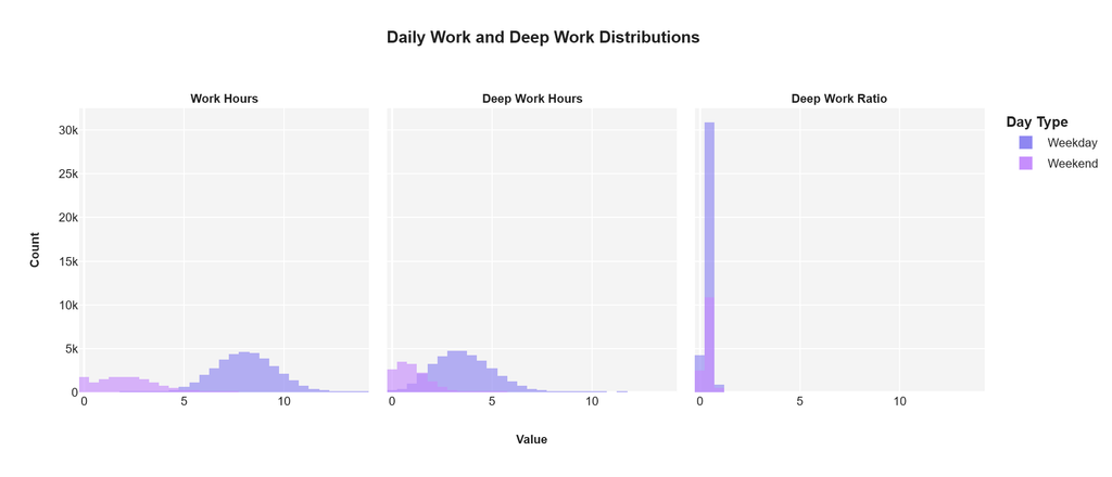
This first chart is basically the “daily reality check.” Before we talk about productivity labels, output, or any fancy model, we need to know what a normal day even looks like inside the dataset. And the answer is very human: weekdays look like full workdays, weekends look like “light mode” days.
On the Work Hours panel (left), weekdays form a big hill around a typical office rhythm. Most weekday workdays cluster roughly in the 6 to 10 hour range, with a clear peak around the middle of that band. Weekends are a different universe. The weekend distribution sits mostly on the 0 to 4 hour range, meaning a lot of days are either fully off or only a short work session. This matters because it tells us something important: when someone says “I worked every day,” the dataset shows that weekdays and weekends are not comparable in intensity, even if both count as “work.”
Now look at the Deep Work Hours panel (middle). Weekdays again dominate, but the shape changes. Deep work is present, yet it is tighter and more conservative. Most deep work on weekdays clusters around low to mid single-digit hours, which is realistic because deep work is harder to sustain than general work time. Weekends show a lot of very small deep work amounts, mostly near 0 to 1 hour, which suggests that weekends are more often recovery, admin, or casual tasks rather than long focus blocks. In other words, weekends do not just have fewer hours, they have fewer “serious focus” hours.
The most interesting part is the Deep Work Ratio (right), which is deep work divided by total work hours. This ratio is a quick way to answer: “How much of my working time was actually focused time?” The chart is heavily concentrated near the low end, meaning most days spend only a small fraction of work hours in deep work. Weekdays still look slightly better than weekends in consistency, but there is a big warning here: ratio can become misleading when total work hours are very small. If someone works 1 hour and deep works 0.5 hour, the ratio looks amazing, but the output might still be tiny. So ratio is a great signal, but it must be read together with total hours and task completion.
What’s the takeaways:
- A “typical” weekday is long enough to allow deep work, but deep work is still a limited slice of the day.
- Weekends are mostly low-hour days, and deep work tends to be minimal, because more company and workers take day off on weekends except the one that having life taking side hustle.
- The deep work ratio suggests that focus time is scarce, which sets up the core question of this article: when does the day flip from High Productive to Mixed, and is it because deep work shrinks, or because work hours get fragmented into noise?
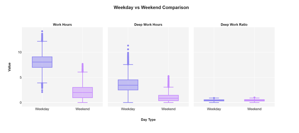
After the first chart, we already got the big picture: weekdays are “full workdays,” weekends are “light mode,” and deep work is usually a smaller slice of total time. This second one is the perfect follow-up because it stops showing blobs of distributions and starts answering a sharper question:
“How different are weekdays vs weekends, in a way we can compare quickly?”
Work Hours: weekdays are the real battlefield
On the Work Hours panel, the weekday box sits much higher than weekend. Translation: the typical weekday has significantly more working time than the typical weekend, not just by a little, but by a whole lifestyle difference. You also see more spread on weekdays, which means weekdays are not only longer, they are also more variable. Some weekday days run long, some are shorter, but most of them live in that “proper workday” zone.
Weekends are tighter and lower. Most weekend days are short work sessions, or almost none. There are still outliers though, those dots above the box. That’s your “I had to work on Saturday” moments. Not common, but definitely real.
Deep Work Hours: weekdays still win, but the ceiling is clear
Now the Deep Work Hours panel makes something very clear: deep work grows on weekdays, but it has a ceiling. Even when work hours are long, deep work rarely scales in the same way. Most weekdays land in a modest deep work range, with some outlier days where deep work gets unusually high. Those are probably the rare days with fewer meetings, fewer interruptions, and a clean block of time.
On weekends, deep work is usually small. The typical weekend deep work is close to “a little focus session,” not “a deep work marathon.” Again, you still see outliers, which are likely personal project days, catch-up days, or “I finally had quiet time” days.
Deep Work Ratio: the sneaky part, ratios look similar
At first glance, weekday vs weekend ratios look quite similar, both sit low and close together. That’s the key lesson: weekends can sometimes look “efficient” in ratio terms simply because total work hours are small. If you work 2 hours and 1 hour is focused, the ratio looks great. But your total output might still be limited because the day is short.
So ratio is useful, but it is not the whole story. A high ratio on a small workday is not the same as a solid deep work block inside a full weekday.
The connective takeaway, why this matters for “High Productive” vs “Uncertain Mixed”
This chart reinforces the baseline such as:
- Weekdays give you more time and more chances for deep work.
- Weekends sometimes look “cleaner” by ratio, but they are often too short to move big tasks forward.
- The real flip from High Productive to Mixed is likely happening on weekdays, because that’s where long hours exist and where fragmentation can silently destroy deep work.
Where “Busy” Finally Turns Into “Done”
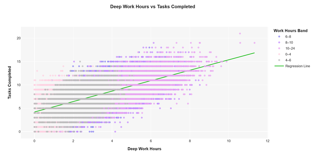
As we already know what a “normal” day looks like in this dataset. Weekdays are longer, weekends are lighter, and deep work is usually only a slice of the total time. But here’s the part people actually care about: does that slice matter, or is it just another productivity buzzword? This chart answers it in the most straightforward way possible, by putting deep work next to something you can’t argue with: how many tasks actually got completed.
Each dot is basically one day of your life. The horizontal axis is how many hours of deep work happened that day, and the vertical axis is how many tasks got finished. The dots are colored by total work hours, so you can also see whether a “long day” behaves differently from a “short day.” And then there’s that green line cutting through everything, showing the overall trend. The line goes up. Clearly. Which is the chart’s way of saying: when deep work increases, task completion tends to rise with it.
What’s more interesting is what happens on the left side, around zero to two hours of deep work. That area is packed with points, meaning a lot of days run with very little deep focus. And the outcomes in that zone are all over the place. Some days still manage to complete a decent number of tasks, but many days don’t. It’s the classic “busy day” problem. You might be active the whole day, replying, moving, attending, switching, but the finished output doesn’t reliably follow. It’s not that nothing happens, it’s that progress becomes unpredictable.
Then you start to notice a shift as deep work moves past roughly four hours. The cloud of points begins to sit higher more consistently. You still see variation, of course, because no day is perfectly controlled, but the pattern looks healthier.
More deep work does not just increase output, it makes the day feel less like a lottery. You can almost see it: the more focused hours you protect, the less likely your day ends with “wait, what did I actually finish?”
The color bands add another layer to the story. Longer work hours can help, but only when deep work comes along for the ride. There are plenty of long days in the dataset, but if deep work stays low on those days, the tasks completed often stay stuck in the middle range. That’s the sneaky part. A long day can still produce average output if it’s fragmented. Meanwhile, a day with fewer total hours can still punch above its weight if a good chunk of it is truly focused.
So if you’re wondering why some days suddenly flip from High Productive to Mixed, this plot already gives a strong clue.
It is not about working more. It is about whether the day contains enough deep work to turn effort into real completion. In the next analysis, it gets even more relatable, because we’ll look at what usually attacks deep work first: meetings, interruptions, and context switching.
The Real Villains Are Not Laziness
This is where the story gets painfully relatable. If deep work is the fuel that turns time into output, then meetings and context switching are the tiny leaks you do not notice until your tank is suddenly empty. This chart is basically asking a simple question everyone has felt: how expensive is it when your day keeps getting interrupted?
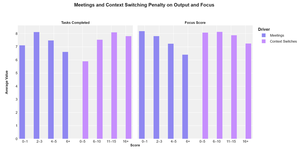
Meetings: Helpful at First, Then They Start Eating Your Day if it takes too long and not in right focus.
On the left panel (tasks completed), output looks solid when meeting volume is low (0–1). It even peaks around 2–3 meetings, which suggests a few meetings can actually help by clarifying priorities, unblocking decisions, or aligning people quickly. But once you move into 4–5 and especially 6+ meetings, average tasks completed drops. It is not a dramatic cliff, but it is consistently trending downward.
The right panel (focus score) makes the pattern sharper. Focus is highest when meetings are minimal and steadily declines as meeting count rises. By the time you hit 6+ meetings, focus is clearly lower, which explains why output also starts slipping. Your attention gets chopped into smaller fragments, and even if you work longer, the brain never really settles into a “real focus” state.
Now the plot twist. For context switching, the tasks completed bars do not collapse the way we expected. In fact, output looks quite high in the 11–15 and even 16+ switching buckets. This is exactly why this analysis is fun: high context switching can happen on days filled with small, quick tasks, operations, admin work, and fast follow-ups. You can complete many tasks while still feeling scattered, because the tasks themselves are short and easy to close.
Even if task completion stays high, the focus score panel reveals the real penalty. Focus remains stronger at low switching, then declines as switching rises, with the clearest drop at 16+. So you might end the day with a decent number of tasks finished, but mentally you feel drained and fragmented. In other words, you were productive on paper, but your brain paid a tax.
Why This Creates “Mixed” Days?
Meetings tend to reduce both output and focus as they pile up. Context switching can still allow tasks to get done, but it erodes focus, which usually kills deep work. And that is how a day flips from High Productive to Mixed: not always because output is low, but because the day becomes high-activity and low-focus.
There Is a Tipping Point: is not that meetings are evil or that switching is always bad. The point is that there is a threshold where the cost becomes obvious. A few meetings can help. Too many meetings steadily drain focus and output. And too much switching might keep tasks moving, but it quietly destroys the conditions needed for deep work, which usually makes tomorrow harder too.
The Moment Your Day Stops Cooperating
This is the part where the data feels like it is reading your calendar back to you. We already saw that meetings and context switching slowly tax your focus, but this chart asks a sharper question: when does “a bit busy” turn into “today is chaos”?
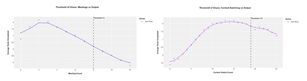
Meetings Have a Sweet Spot, Then They Start Taking More Than They Give.
On the left chart, average tasks completed actually climbs at first. It peaks around 2 to 3 meetings, which makes sense because a couple of meetings can genuinely unblock work. You align fast, make decisions, and move on. It is the productive version of social interaction.
Then the curve starts sliding downward, and by the time you hit the dashed line at about 8 meetings, the day is clearly in trouble. Output is noticeably lower and it keeps dropping after that. The message is not “meetings are evil.” The message is that once you cross a certain count, your day stops being a workday and becomes a meeting-shaped obstacle course.
Context Switching Looks Fine Until It Suddenly Isn’t, The right side is sneakier. Tasks completed rises steadily as context switches increase, which sounds weird at first. But it is actually realistic. More switching can mean you are doing lots of small tasks: replying, approving, fixing, following up, closing loops. It feels fast and busy, and the dataset reflects that because output climbs up to a point.
The Chaos Threshold for Switching Hits Around 19 and what’s that mean?
Then the dashed line appears at about 19 context switches, and the curve begins to decline. That is the key insight. Switching can help you churn through quick tasks up to a certain level, but after that, it becomes self-sabotage. Past the threshold, you are not multitasking anymore. You are fragmenting your brain so much that even small tasks start taking longer, and the overall output slips.
This is exactly how a day flips from High Productive to Mixed without you doing anything “wrong.” You are still working. You are still moving. You might even be finishing tasks. But past these thresholds, the day becomes brittle. Small interruptions create big delays, your attention never settles, and the day starts to feel noisy instead of meaningful.
The Practical Wake-Up Call
If you want two simple lines that can guide your day design, this chart basically hands them to you: around 8 meetings per day is where output starts falling hard, and around 19 context switches is where the churn stops paying off. You do not need perfect discipline. You just need guardrails that keep you away from the cliff.
The Plot Twist: Focus Can Be High in Two Very Different Ways
Up to now, we have been talking about time and interruptions, but this chart switches the lens to something more human: how your day actually feels internally. Because two people can both look “productive” on paper, yet one ends the day calm and satisfied while the other ends the day fried. This first chart in Analysis 5 i have done is basically a map of that difference.
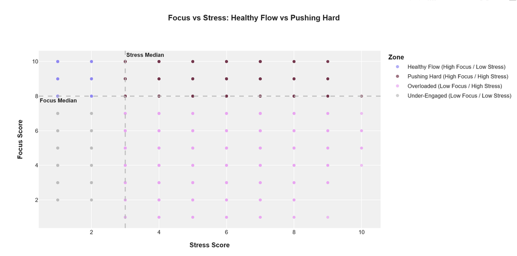
How to Read This Without Overthinking It
The horizontal axis is stress score, the vertical axis is focus score. The dashed lines mark the median stress and focus, splitting the chart into four zones. Think of it like a simple compass: up is more focused, right is more stressed. The colors label each quadrant with a personality.
Healthy Flow: The Sweet Spot Everyone Wants, In the top-left zone (high focus, low stress), you get Healthy Flow. This is the “I got a lot done, and it did not cost my soul” kind of day. It is focused, clear, and usually comes from having enough uninterrupted time, realistic workload, and fewer surprise fires. If your goal is sustainable productivity, this is the zone you want to visit most often.
Pushing Hard: Productive, But It Comes With a Price: Now look at the top-right zone (high focus, high stress): Pushing Hard. This is where you are still locked in, still performing, still executing, but your nervous system is running hot. These are deadline days, urgent days, high-stakes days. The important insight is that high focus is not always “healthy focus.” The chart literally separates “good focus” from “expensive focus.”
Overloaded: When Stress Wins and Focus Collapses
Bottom-right is Overloaded (low focus, high stress), and this is the danger zone. This is what happens when the day has pressure plus fragmentation. Too much to handle, too many demands, not enough mental space. It is the kind of day where you feel busy, but progress feels slippery. This zone is also the easiest place for a day to turn Mixed, because you are spending energy just managing the chaos.
Bottom-left is Under-Engaged (low focus, low stress). This is not necessarily “bad,” but it is often a sign of low intensity. Maybe it is a recovery day, maybe the work is boring, maybe it is a weekend with light tasks. The key point is: low stress alone does not equal a good day. You can be calm and still not move anything important forward.
Why This Chart Matters for the Whole Article?
This chart adds a really important nuance to everything we have discussed: the goal is not only to increase output. The goal is to increase output in a way that keeps you in Healthy Flow more often than Pushing Hard or Overloaded. Because if your productivity depends on high stress, it is not a system. It is a temporary sprint.
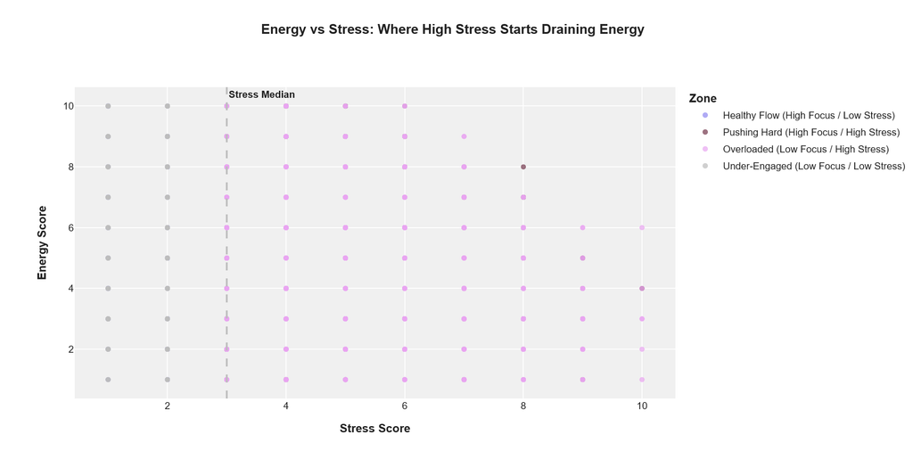
Stress Does Not Just Hurt Focus, It Eats Your Battery
After mapping focus vs stress, this second chart answers the question everyone feels in their body: “Okay, but what about energy?” Because you can sometimes force focus for a day. You can even brute-force output. But energy is the part that quietly tells you whether your pace is sustainable or whether you are borrowing from tomorrow.
The dashed vertical line marks the stress median, which is basically the dataset’s “normal stress baseline.” Left of that line is lower-than-usual stress, right of it is higher-than-usual stress.
Low Stress Days Look Like “Recharge Mode”, On the left side of the chart, where stress is low, energy scores are spread higher and feel more stable. You see a lot more points living in the upper range. This is the day where you can work, still feel okay, and not end the evening feeling like your brain is overheating. It is not lazy. It is sustainable.
The Drain Starts Showing Once Stress Moves Past the Middle.
Once you cross the median stress line and move into higher stress territory, the pattern shifts. Energy becomes more mixed, and you start seeing more days landing in the mid-to-lower energy range. It is not that high stress guarantees low energy every single time, but the “high energy while stressed” days become less common and harder to maintain.
The Real Red Flag Is High Stress With Low Energy, and that is for sure!
The most important zone here is the combination that feels like burnout in slow motion: high stress, low energy. Those are days where you are not only pressured, but also running low internally.
This is usually when people start making sloppy decisions, procrastinating in weird ways, or relying on caffeine and adrenaline to survive the day. If focus also drops on those days, you end up in the Overloaded zone we saw earlier: busy, stressed, and mentally scattered.
This explains why the flip can happen suddenly. A day can start with decent focus, but as stress builds, energy drains, and then focus becomes harder to hold. Once energy drops, everything becomes heavier: switching tasks feels painful, meetings feel louder, and deep work becomes nearly impossible to protect. Mixed days are often not a time problem. They are an energy problem disguised as a schedule problem.
If deep work is your output engine, then energy is your ability to keep that engine running tomorrow. And this chart suggests a simple truth: higher stress makes high energy rarer, and the cost shows up not always as lower output immediately, but as a lower capacity to sustain focus across days.
The Fun Part: When Your Calendar Has Personalities
We have been looking at single relationships, like deep work vs output, meetings vs focus, stress vs energy. But real life is never one variable at a time. Real days are messy bundles. Some days feel smooth and productive, some feel busy-but-empty, and some feel like you spent eight hours putting out fires. This is why clustering is exciting. Instead of asking “what affects what,” we ask a more human question: what kinds of days keep showing up in my life?
Clustering Turns Chaos Into Day Characters
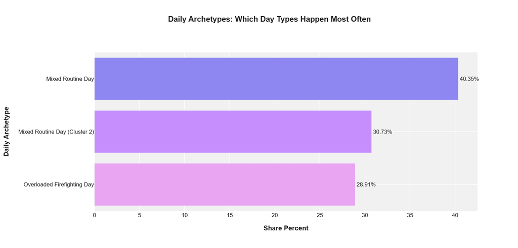
A mix of signals: work hours, deep work, meetings, context switches, tasks completed, focus, stress, and energy. Think of it like Netflix categories, but for your workdays. The chart you shared is the first payoff: it tells us which “day archetypes” happen most often in the dataset.
The Most Common Reality: Mixed Routine Days Dominate
The biggest bar is Mixed Routine Day at 40.35%. That is not a rare edge case, it is the default lifestyle. A Mixed Routine Day usually means you did a bit of everything. Some work got done, some focus happened, but the day also had interruptions and switching. It is not terrible, but it is also not deeply satisfying. This is the kind of day where you can honestly say, “I was busy,” but you might still hesitate when someone asks, “What did you finish?”
Mixed Routine Day (Cluster 2): Same Vibe, Slightly Different Flavor
The second biggest group is Mixed Routine Day (Cluster 2) at 30.73%. The fact that “mixed” appears twice is already a story. It suggests there are at least two common versions of mixed days in real life. One might be more meeting-heavy, the other might be more context-switch-heavy. One might have decent tasks completed but low energy. The chart does not show those details yet, but it signals something important: mixed is not one problem. It is a family of problems.
The Alarm Bell: Overloaded Firefighting Days Are Not Rare
Then comes the one that should make readers pause: Overloaded Firefighting Day at 28.91%. That is almost three out of ten days. Firefighting days are typically high stress, lower focus, and lots of reactive work, the kind of day where priorities get decided by whoever interrupts you last. Even if you complete tasks, they are usually urgent tasks, not important ones. And the long-term cost is brutal: these days do not just steal today’s deep work, they also drain tomorrow’s energy.
The Big Wake-Up Message of This part:
If you combine the two Mixed clusters and the Overloaded Firefighting cluster, you get a simple but powerful punchline: most days are not “deep focus days.” Most days are either mixed or reactive. That fits perfectly with the article’s title, because it explains why being busy is so common while feeling truly productive is rarer than people expect.
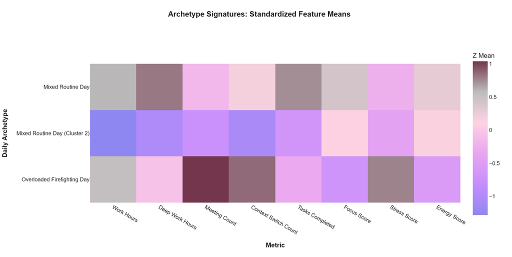
If the previous chart told us which day types show up most often, this heatmap tells us what each day type is actually made of. Think of it like a personality fingerprint. Each row is one archetype, each column is a metric, and the colors show whether that archetype is above or below the overall average (standardized Z-scores). Darker toward one end means “more than usual,” lighter toward the other end means “less than usual.”
Mixed Routine Day: Productive-ish, But Not Peaceful
The first row, Mixed Routine Day, looks like the classic “solid but messy” workday. Work hours and deep work are generally above average, and tasks completed are also on the healthier side. But the trade-off shows up immediately: stress is higher than average and energy is not exactly thriving. This is the day where you get things done, but it costs you a bit. It is the kind of day that feels fine in the moment, then you realize at night your brain is still buzzing.
The second row, Mixed Routine Day (Cluster 2), is the calmer-looking cousin. Work hours, deep work, meetings, switching, and tasks completed all sit below average. Focus and stress look closer to neutral, and energy is slightly better. This archetype feels like a “lighter day” where not much explodes, but not much truly moves forward either. It is not chaos, it is not excellence. It is the day where you are active enough to feel busy, but you do not have a clear win.
Now the third row is the one people recognize instantly: Overloaded Firefighting Day. Meetings and context switching are strongly above average, stress is high, energy is low, and focus is clearly below average. Even if work hours are not wildly low, the day is structurally hostile to deep work. This is the day where your attention keeps getting hijacked. You spend the whole day reacting, and even if you complete tasks, they are often urgent tasks, not meaningful tasks.
The Big Pattern: Mixed Days Fail Quietly, Firefighting Days Fail Loudly
Here is the most useful interpretation for readers. Mixed days can feel “okay” because they still produce output, but they quietly drain energy and raise stress over time. Firefighting days are the opposite: they are obviously stressful and mentally expensive, and they crush focus immediately. Both can lead to Mixed productivity labels, but through different paths. One is slow erosion, the other is direct chaos.
This is where everything ties together. The earlier analyses showed that deep work correlates with output, meetings and switching have tipping points, and stress drains energy. This heatmap bundles all of that into three characters and basically says: “These are the combinations you keep living.” It also explains why “busy” is such a common feeling. The most frequent archetypes are not pure deep focus days. They are mixed or reactive by design.
If a you wants to use this immediately, the question becomes simple: which archetype do you fall into most often? If it is Mixed Routine Day, the goal is to protect more deep work and reduce stress cost. If it is Mixed Routine Day (Cluster 2), the goal is to increase meaningful output without adding chaos. If it is Overloaded Firefighting Day, the goal is not “work harder.” The goal is to reduce meeting and switching load back under the chaos thresholds we found earlier.
Individual Consistency & Burnout Risk

If there is one section in this whole article that can quietly change how someone designs their life, it is this one. Up to now we have been looking at daily patterns: meetings, switching, stress, energy, and the kind of days that show up most often. But this analysis zooms out to the person level and asks a more uncomfortable question: what happens over time to people who keep protecting deep work, versus people who don’t? Not for one day. For their entire rhythm.
What “Deep Work Consistency” Really Means Here
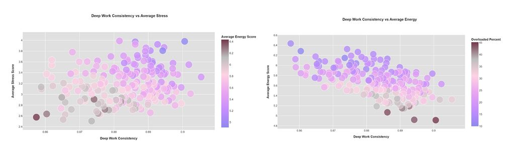
On both charts, the X-axis is deep work consistency. This is not “how many hours you did deep work once.” It is closer to “how reliably you keep deep work in your life.” In real-world terms, it is the difference between someone who protects focus as a habit, and someone who only gets deep work when the universe is kind.
Look at the left chart first: Deep Work Consistency vs Average Stress. The dots drift upward as consistency increases, meaning stress tends to be a bit higher for people who are more consistent. That sounds like bad news, until you realize what it actually reveals. Consistency is not automatically “zen.” If someone is consistent because they keep pushing, they can still carry stress. In other words, deep work can be done in two styles: a healthy rhythm, or a high-pressure performance mode.
This is why the color on the left chart matters. It is shaded by average energy score. You can see that people with higher stress often sit in lower-energy shades. That is the giveaway: stress alone is not the enemy. Stress plus low energy is the danger. If your consistency is coming from constant pressure, your energy slowly becomes the bill you pay later.
The Trade-Off Shows Clearly, Energy Slips as Consistency Rises
Now look at the right chart: Deep Work Consistency vs Average Energy. Here the relationship is clearer and more alarming: as consistency increases, average energy trends downward. At first glance it feels backwards. Shouldn’t deep work make you feel better? But this is exposing something brutally important: consistency without recovery becomes performance strain.
On the right chart, the color scale represents Overloaded Percent, basically how often someone falls into overloaded days. The darker the dot, the more overloaded days they experience. And those darker dots tend to sit lower in energy. That is the key bridge connecting both charts: it is not deep work itself that drains you. It is deep work consistency combined with a high share of overloaded days. That combination creates a pattern where your focus becomes sustainable in the short term, but your energy becomes fragile in the long term.
This is the crucial takeaway. This suggest two very different “consistent deep workers” can exist. One type is consistent because they have a clean system: fewer overloaded days, stable energy, and manageable stress. The other type is consistent because they are forcing it: more overloaded days, energy trending down, and stress creeping up. On paper, both look disciplined. In the body, they are living completely different futures.
Why This Is a Big Deal for “Busy Didn’t Mean Productive”
Busy does not mean productive, and this dataset adds a sharper layer: consistent does not automatically mean safe. You can be consistent because you have a clean system, or consistent because you are forcing it every day, and that second version is where burnout quietly grows. The risk is not just a bad day, it is a slow slide where energy trends down, overloaded days show up more often, and your body starts treating work like a daily emergency.
That is why the real goal is not only “do more deep work,” but “make deep work sustainable.” The healthiest productivity comes from consistent deep work with a low overloaded percentage, because overloaded days are not just noisy, they are expensive: they drain energy, raise stress, and make the next day harder, creating a loop of more stress, lower energy, more overload.
The practical move is to build guardrails that lower burnout inputs, keep meetings below the chaos threshold when possible, cut context switching before it becomes extreme, and protect at least one focus block that is truly non-negotiable, because the goal is not to win one day, it is to stay effective without slowly burning yourself out.
The Final Reality Check: Do These Labels Actually Mean Anything?

After all the charts, trends, and thresholds, this is the moment we stop theorizing and ask the most practical question possible: if we call a day “High Productive,” “Mixed,” “Low Focus,” or “Overloaded,” do those labels match what the metrics are actually doing? This chart is basically the dataset looking in the mirror and saying, “Okay, be honest.”
High Productive Days Look Exactly Like You’d Hope
Start with the High Productive column across the panels, and the pattern is satisfyingly consistent. Deep work hours sit higher, tasks completed are clearly higher, and focus score is the strongest of all groups. Meeting count is not extreme, and stress stays relatively controlled. It is the cleanest signature in the whole chart: more deep work, more output, better focus, without turning the day into chaos. This is what a “good day” looks like in data, not just in vibes.
Mixed Days Are the Most Relatable, And the Most Confusing
Mixed sits right in the middle on almost everything, which is exactly why it is the most common real-life experience. Deep work is lower than High Productive, tasks completed drop, focus drops a bit, and meetings and switching start creeping in. Mixed days are not disasters, they are noisy. They are the days where you did work, but the day had too many small pulls for it to feel clean. This matches the earlier archetype story: “Mixed Routine Day” dominates because most calendars produce mixed conditions by default.
Low Focus Days Are Not Just Low Output, They Are Low Deep Work
Low Focus is where the pattern becomes almost too honest. Deep work hours drop further, tasks completed slide down, and focus score is the lowest among the non-overloaded categories. What is interesting is that meetings are not necessarily the highest here, meaning Low Focus is not always caused by meeting overload. It can be caused by something quieter: lots of switching, low energy, or mental fragmentation that never fully escalates into “overload,” but still kills deep work. This is the day where you are present, but mentally slippery.
Overloaded Days Are “Busy” in the Worst Possible Way
Overloaded is the label that looks exactly like the earlier chaos charts predicted. Meeting count is the highest, context switching is the highest, stress is the highest, and focus is under pressure. Tasks completed are not the lowest, which is the scary part. You can still complete tasks while overloaded, but the cost shows up in stress and the quality of attention. Overloaded is the perfect example of the article’s title: you can be extremely busy and still not be in a state that feels productive, sustainable, or healthy.
The Big Connection: Labels Map Directly to the Drivers We Found Earlier
This is why this final chart ties everything together so nicely. High Productive aligns with the deep work effect we saw in Analysis 2. Overloaded aligns with the meeting and context switching tipping points we saw in Analyses 3 and 4. Low Focus aligns with the internal focus-stress-energy patterns we explored in Analysis 5. And Mixed is the default bridge state that most people live in, which matches the clustering section where Mixed Routine Days dominated.
It Is Not Random, It Is a System
The most important takeaway is that these labels are not just vibes, they have real, measurable profiles. If someone wants to move from Mixed to High Productive, the chart suggests the simplest lever is deep work hours. If someone wants to escape Overloaded, the lever is reducing meeting load and context switching below the chaos thresholds. And if someone keeps landing in Low Focus, the lever is not always “more discipline,” it is often repairing the conditions that support focus: energy, stress load, and fewer fragments.
If you remember one sentence from the whole article, let it be this: a productive day is not the day you worked the most, it is the day your focus had enough space to produce real output without triggering overload and burning yourself out.
Author’s Notes:
The analysis presented here is purely for educational and Exploratory Data Analysis purposes. This article is not a scientific study but a data analytics learning project based on mirroring real-world behavioral datasets. Any statements should be understood and commented within the context of the samples analyzed, not as universal real conclusions.
Parts of the data analysis and visualization in this article i created by using Phyton, Pandas & NumPy Libraries, Scikit Learn, Plotly express. And i utilized Chat GPT.5 Codex to streamline and refine the code for better workflow. Hero Images was generated using Gemini: Nano Banana.